Definition:
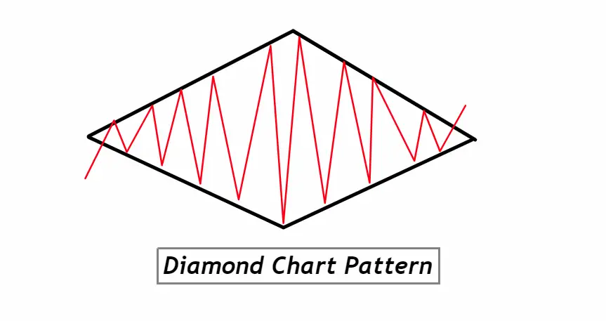
The Diamond Chart Pattern is a technical analysis formation that signals a potential trend reversal, often characterized by a broadening price movement followed by a narrowing one, resembling the shape of a diamond. A rare but significant pattern, the Diamond Chart Pattern often emerges at the peaks and troughs of markets, providing traders with clues about impending bullish or bearish reversals.
How to Identify the Diamond Chart Pattern on a Chart:
- Formation Timeframe: The pattern typically forms over a few weeks to a few months. Although it can be seen on various timeframes, it’s more reliable on longer-term charts.
- Broadening Formation: The start of the diamond usually shows a broadening price action, where both support and resistance lines diverge from each other.
- Narrowing Formation: After the broadening phase, prices begin to contract, leading to converging support and resistance lines, completing the diamond shape.
- Volume Analysis: Volume often plays a key role. Initially, as the pattern starts to form, volume tends to increase. However, as the pattern progresses, especially during the narrowing phase, volume typically decreases.
- Support and Resistance: Identify four distinct trend lines within the pattern:
- Upper Trend Line (Rising): Connects the initial high to the highest point of the broadening formation.
- Upper Trend Line (Falling): Connects the highest point of the broadening formation to the point where prices start to narrow.
- Lower Trend Line (Falling): Connects the initial low to the lowest point of the broadening formation.
- Lower Trend Line (Rising): Connects the lowest point of the broadening formation to where prices start to narrow.
- Breakout/Breakdown Confirmation: The pattern is confirmed once the price breaks above the resistance (for a bullish reversal) or below the support (for a bearish reversal) of the diamond shape, often accompanied by a surge in volume.
- Central Horizontal Line: Sometimes, traders also look for a horizontal line running through the center of the diamond. This can act as a minor support or resistance level, offering an early indication of a possible breakout or breakdown direction.
By identifying these critical elements on a chart, traders can efficiently spot the Diamond Chart Pattern and prepare for potential market reversals.
Significance of the Diamond Chart Pattern:
1. Reversal Indicator: One of the primary significances of the Diamond Chart Pattern is its ability to signal a potential trend reversal. Whether found at a market top or bottom, this pattern can alert traders to an impending shift from a bullish to bearish trend or vice versa. Such early indications give traders a heads-up, allowing them to adjust or plan their positions accordingly.
2. Reliable, Yet Rare: The Diamond Chart Pattern isn’t as frequently observed as other patterns, such as the Head and Shoulders or Double Top/Bottom. However, its rarity can be an advantage. When it does appear, it often signifies a strong and decisive reversal, making it a pattern that traders pay special attention to when it emerges.
3. Clarity on Entry and Exit: For traders, precise entry and exit points are crucial. The Diamond Chart Pattern offers this clarity. Once the pattern is identified, a breakout or breakdown from the diamond shape provides a clear entry point. Concurrently, the extremities of the diamond (its widest points) can serve as reference levels for stop-loss placements, thereby aiding in risk management.
4. Volume Reinforcement: The Diamond’s significance is often reinforced by accompanying volume patterns. An increase in volume during the broadening phase, followed by a decline in the narrowing phase, and finally a surge during the breakout/breakdown offers additional confirmation of the pattern. This volume behavior can bolster a trader’s confidence in the pattern’s reliability, making the Diamond Chart Pattern a potent tool in a trader’s arsenal.
Activity of Big Traders During the Formation of the Diamond Chart Pattern:
1. Accumulation and Distribution: The initial broadening phase of the Diamond Chart Pattern often represents a period of indecision, where big traders, or “smart money,” begin their activities. If the diamond is forming at a market top, these institutional players might be distributing or selling their positions to retail traders. Conversely, at a market bottom, they might be accumulating or buying assets stealthily.
2. False Signals and Traps: The erratic price movement within the diamond, particularly during its broadening phase, can be seen as big traders setting traps. For instance, sudden spikes in price might lure retail traders into thinking a continuation of the prevailing trend is imminent. However, these spikes could be manipulative tactics by institutional players to offload or acquire more significant positions.
3. Volume Tells the Story: The declining volume during the narrowing phase of the diamond suggests a decrease in participation from retail traders, often due to uncertainty or fear of getting caught on the wrong side of the trade. On the other hand, this phase can be a period where the big traders are solidifying their positions, waiting for the right moment to initiate the next strong move.
4. Confirmation and The Final Push: The breakout or breakdown from the diamond shape is where the intentions of the big traders become most evident. A surge in volume accompanying this move indicates their active participation. If the breakout is bullish, it suggests that the accumulation phase by institutional traders during the diamond’s formation has culminated, and they are now pushing prices higher. If bearish, it signals the end of their distribution phase, driving prices downward.
For retail traders, understanding the maneuvers of big traders during the Diamond Chart Pattern’s formation is vital. It offers insights into the underlying market dynamics and can aid in making more informed decisions, rather than being swayed by surface-level price movements alone.
Diamond Chart Pattern Confirmation Table
| Confirmation Tool | Description & Importance |
|---|---|
| 1. Key Support and Resistance Levels | These are critical price levels where the asset has historically shown significant buying or selling pressure. A break through these levels post-pattern formation, especially when aligned with the Diamond’s breakout/breakdown direction, offers added conviction. |
| 2. Break of Pattern Extremities | If, after the diamond formation, there’s a break of the high (for bullish reversal) or low (for bearish reversal) of the pattern, it strengthens the reversal signal. It indicates that the market has decisively chosen a direction. |
| 3. Volume Analysis | A significant surge in volume during the breakout/breakdown phase suggests strong participation and confirmation. Low volume during the narrowing phase followed by high volume at the breakout/breakdown is a classic confirmation sign. |
| 4. Technical Indicators | Tools like the Relative Strength Index (RSI), Moving Average Convergence Divergence (MACD), or the Stochastic Oscillator can provide additional confirmation. For instance, divergence between the RSI and price movement during the pattern can bolster its reliability. |
By cross-referencing the Diamond Chart Pattern with these confirmation tools, traders can significantly enhance the probability of making accurate and profitable trade decisions.
Optimal Conditions for Trading the Diamond Chart Pattern
Best Timeframe: Daily and weekly charts tend to offer the most reliable signals for the Diamond Chart Pattern. While it can appear on shorter timeframes, the longer ones reduce the noise and provide clearer formations.
Trading Session: The pattern’s effectiveness is most pronounced during main trading sessions when liquidity is high, such as the New York or London sessions for Forex, or regular trading hours for stock markets.
Winning Ratio: Although results may vary based on individual trading strategies and market conditions, a well-executed Diamond Chart Pattern strategy can yield a winning ratio of approximately 60-70%. Always remember, risk management and proper confirmation are crucial to maintaining and even improving this ratio.
Diamond Chart Pattern Trading Strategy with Confluence
1. Entry Point:
- Bullish Reversal: Enter a long position when the price breaks above the upper resistance of the diamond, especially if this breakout is accompanied by a high volume surge or other confirming indicators.
- Bearish Reversal: Enter a short position when the price breaks below the lower support of the diamond, again looking for high volume or other confirming signals.
2. Stop-Loss Placement:
- Bullish Reversal: Place a stop-loss just below the lowest point (bottom) of the diamond.
- Bearish Reversal: Place a stop-loss just above the highest point (top) of the diamond.
3. Take Profit Level:
- Establish your take profit level by measuring the height of the diamond at its widest point and projecting that distance from the breakout/breakdown point. For a more conservative approach, consider taking partial profits at significant support or resistance levels before your target.
4. Adding Confluence:
- Utilize other technical tools like the RSI, MACD, or Fibonacci retracements/extensions to reinforce your decision. For instance, an RSI divergence during the formation of the Diamond pattern could bolster the pattern’s reversal signal.
- Watch for retests of the diamond’s boundaries post-breakout or breakdown. A successful retest (bounce off for bullish, resistance hold for bearish) can serve as added confirmation.
Conclusion:
The Diamond Chart Pattern, when recognized and traded correctly, offers traders a robust framework to anticipate market reversals. The true power of this pattern emerges when used in conjunction with other technical tools, establishing a confluence of signals that can significantly improve decision-making precision. As with all strategies, disciplined risk management and continuous learning are essential to harnessing the pattern’s full potential.